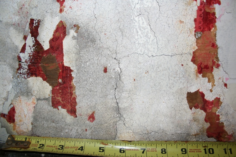
So, long story short… Before we committed ourselves to a final decision on the study wallpaper, I thought it advisable to check one more time behind the massive radiator where I discovered the initial fragments. This time though, rather than just investigating with camera and flashlight, thanks to the kind offices of our superintendent, Jorge Teixeira, we actually removed the 400 pound beast – with the help of three men! And this is what I found:

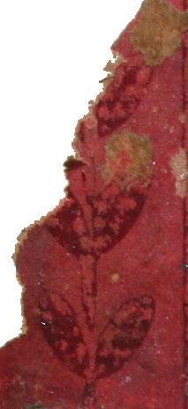
Uh oh… See that little leaved bit in the upper left-hand corner? Another fragment of the pattern had come to light.
Here’s an expanded view:
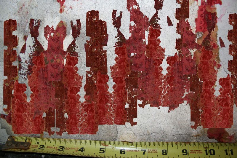
So now, what to make of the pattern? It turns out we were only partially correct on our first version, but fortunately, thanks to the little dot at the 0-inch mark at the lower left hand corner of the first view, we were finally able to determine the repeat with accuracy by flipping and overlaying the detached pieces I found with those still on the wall. That little section really was a lifesaver, because if it hadn’t been for this single bit in situ, there would have been no way to determine the repetition.
Here’s what the pattern looks like, matching extant bits on the wall with recovered fragments:

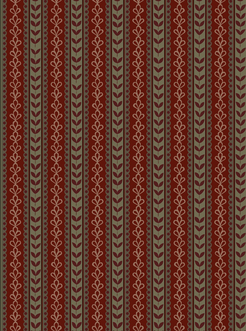
And voila! Our interpretation:

Note that I say “interpretation.” Given the the poor condition of existing fragments, there’s no way (within our budget, at least) to really determine the original color palette of the paper with absolute accuracy. Though the fragments read mostly red now, they are heavily faded, covered with paint and mastic, and have been subjected to 110 years of heat and light. Originally, the various bands were most likely some other complementary color such as olive green, brown or dark burgundy. Kari Pei, the Director of Design at Wolf-Gordon, whose company is donating the paper for the Suite, sifted through a large number of Victorian paper samples, and proposed several probable color schemes based on patterns of the period. Like so many other things in a project lacking direct photographic evidence, we simply have to make a best guess in keeping with our mission to invoke the period. Of the various options, the one above proved the favorite. The paper’s exact hues by the way, are not yet set. (And how you see them will vary greatly depending on your computer monitor.) The overall final effect should be burgundy/olive green, and we’ll be working with interior designer Kai Chao to coordinate the final shades of the bands with the fabric for draperies, the Morris chairs, as well as the paper for the bedrooms and hall.
And speaking of Kari, she deserves a special word of thanks. Not only is her firm making a substantial donation to our efforts, but she herself put in dozens of hours, handcrafting the design you see above. In fact, she produced over 20 different versions of the FDR paper, each time tweaking and adjusting the pattern as new information came to light. I’m particularly pleased with the way she was able to recreate the loose informality of the original fragments. Her careful eye noticed that the loops in the fleurs de lys, as well as the leaves, varied in sequence, and if you scroll quickly over the design above, you’ll see she was able to replicate that hand-drawn appearance. Quite a feat to replicate on computer!
And one final note: thanks to your generosity – several of you at the Trustee level, bravo! – we’ve acquired the piano! A very special round of applause goes out to Michael Silver, Dean LeBaron, Richard Mayer, Gilbert O’Connell and Pam & Elmer Grossman. Pam, by the way, is the granddaughter of FDR’s roommate and life-long friend, Lathrop Brown. During their visit here in September, she and Elmer provided us with a wealth of fascinating material which I’ll be sharing with you over the next few weeks.

Remarkable job of detective work. Thanks so much for all your extraordinary work.